ExB
Inahaus Studio
Branding / VIsual Identity
Graphic Designer
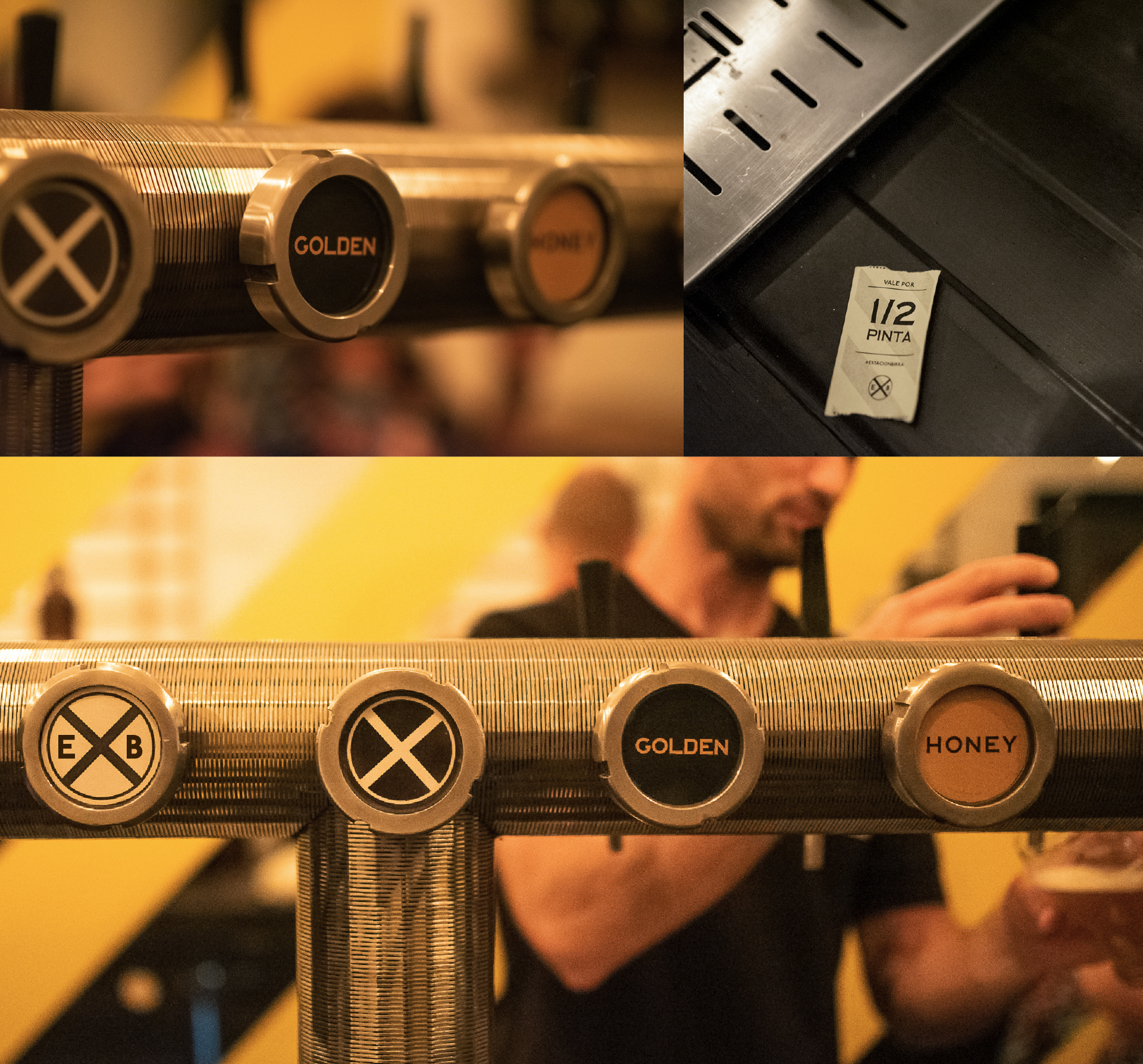
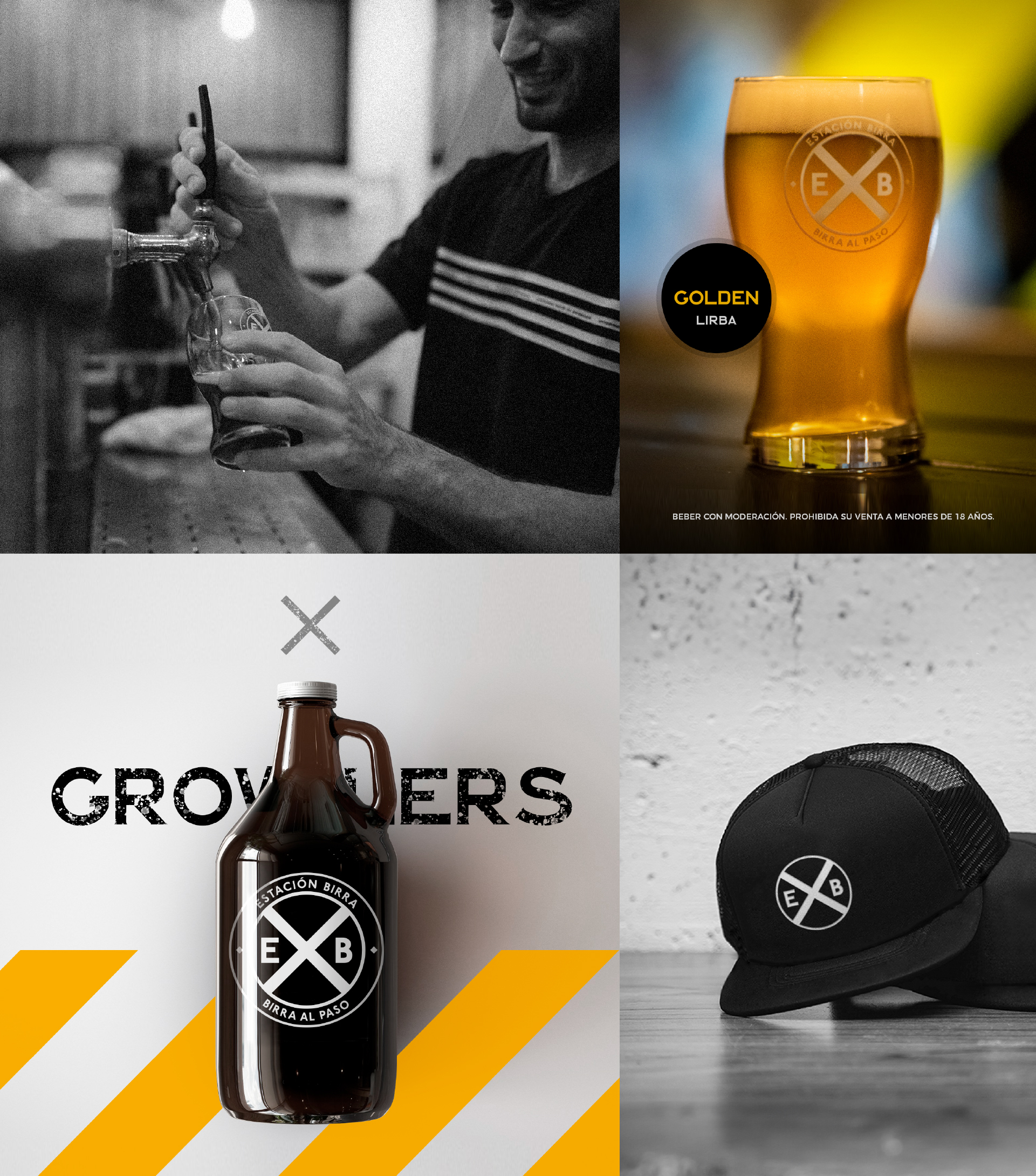
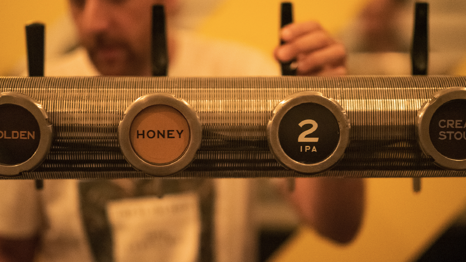
Visual identity development for a new craft beer bar, providing a growler refill service in a central city location.
Inspired by the concept of connection and convergence and with the purpose of representing a meeting point and exchange of experiences, the visual identity was developed based on the metaphor of a train station, taking the famous New York underground station as a reference.
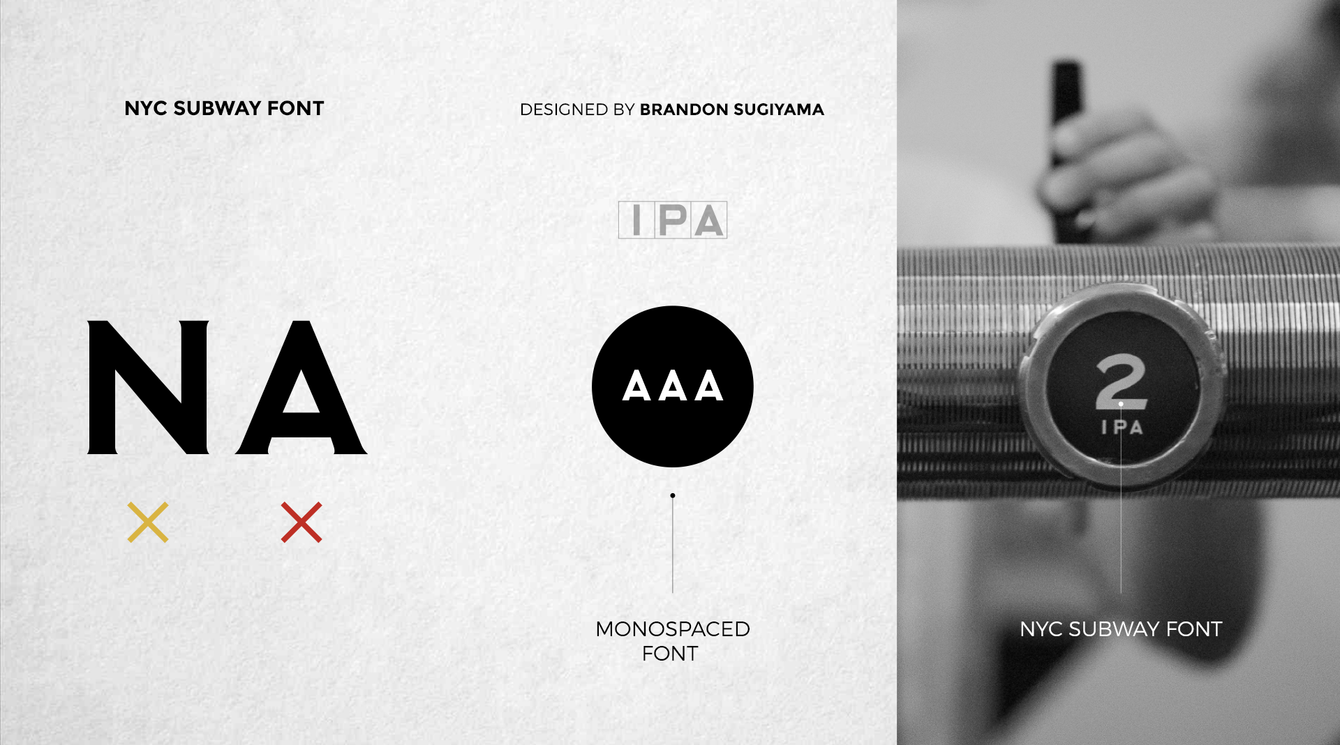
The visual identity was developed from the use of NYCSUBWAY FONT, a typeface designed by Brandon Sugiyama and inspired by the New York underground.
Its retro-modern style perfectly evokes the "underground" atmosphere of the tunnels and underground trains, adding a touch of authenticity and dynamism to the brand.
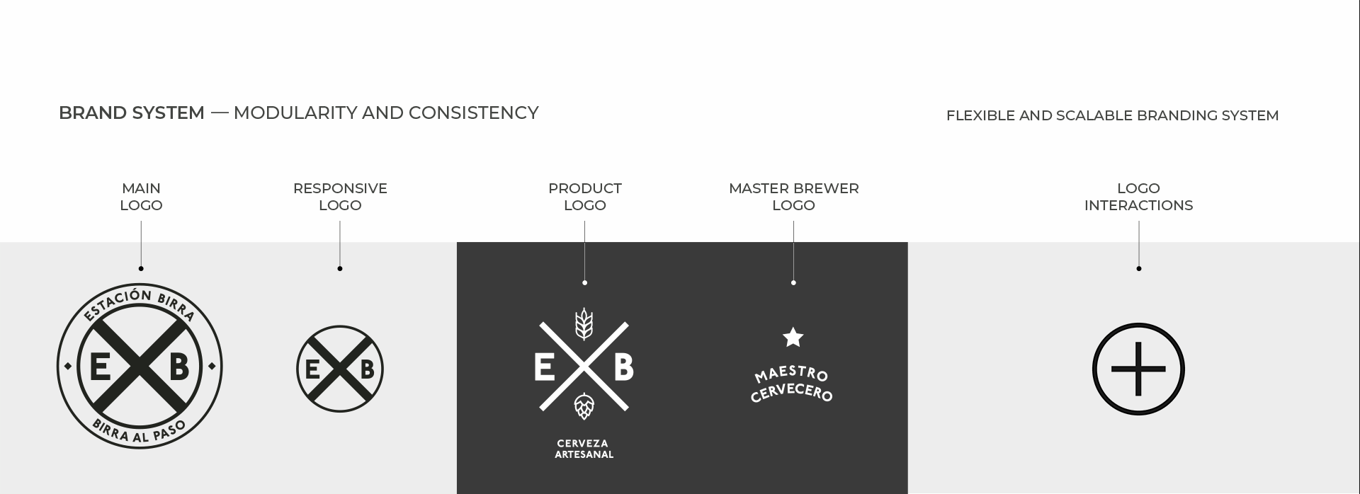
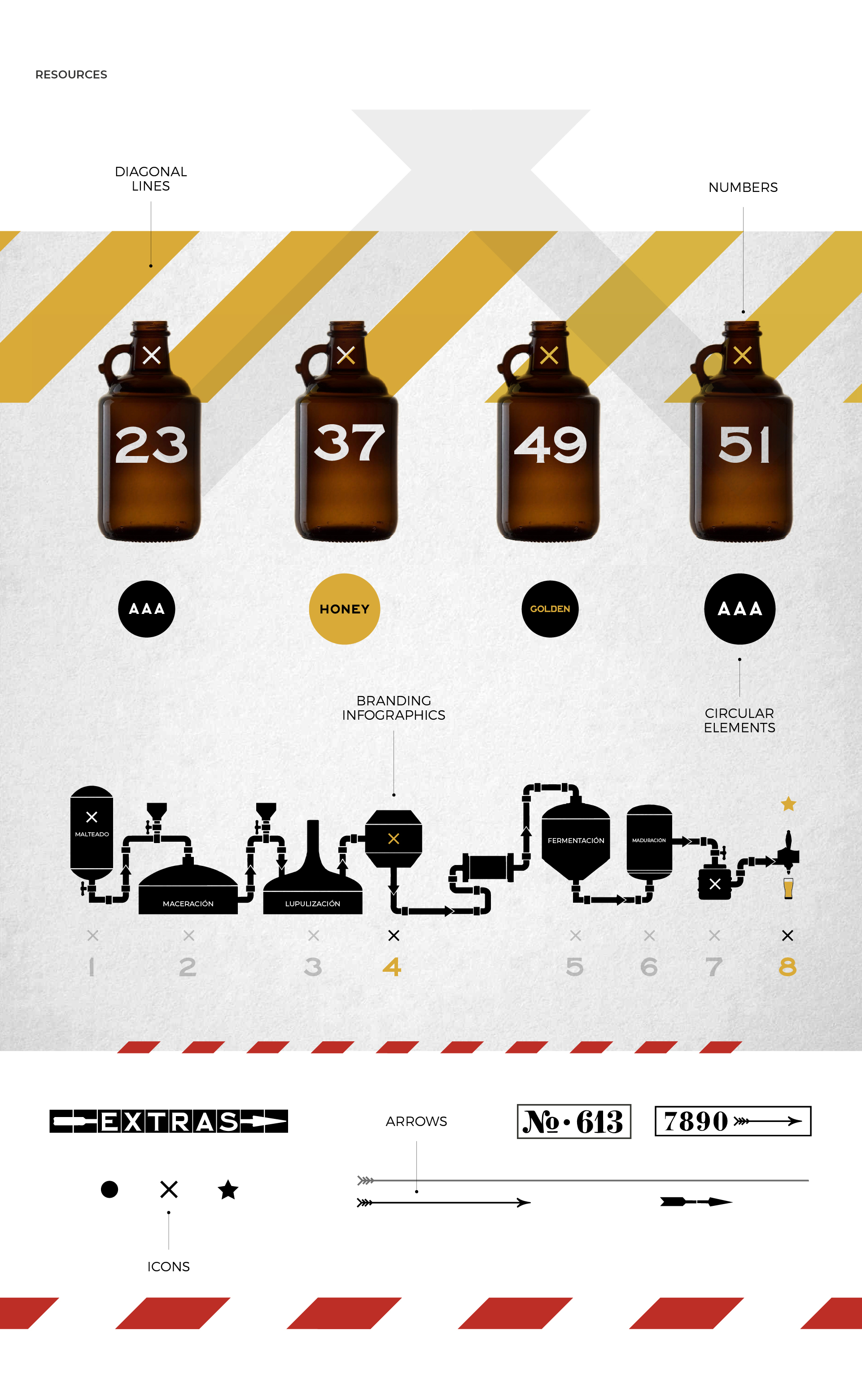
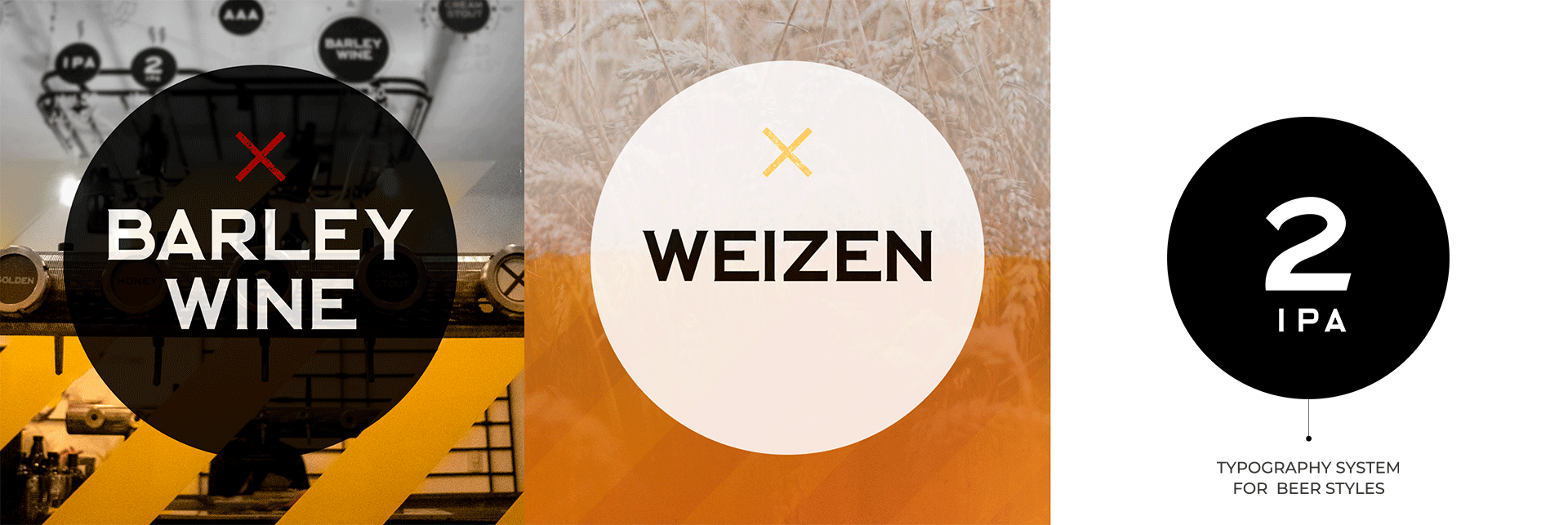
The visual resources used are inspired by the New York train station to enhance and empower the brand concept and identity. These elements capture the essence and visual language, bringing authenticity and consistency to the brand experience.