PEZ Cine
PAR Audiovisual
Branding / VIsual Identity
Graphic Designer
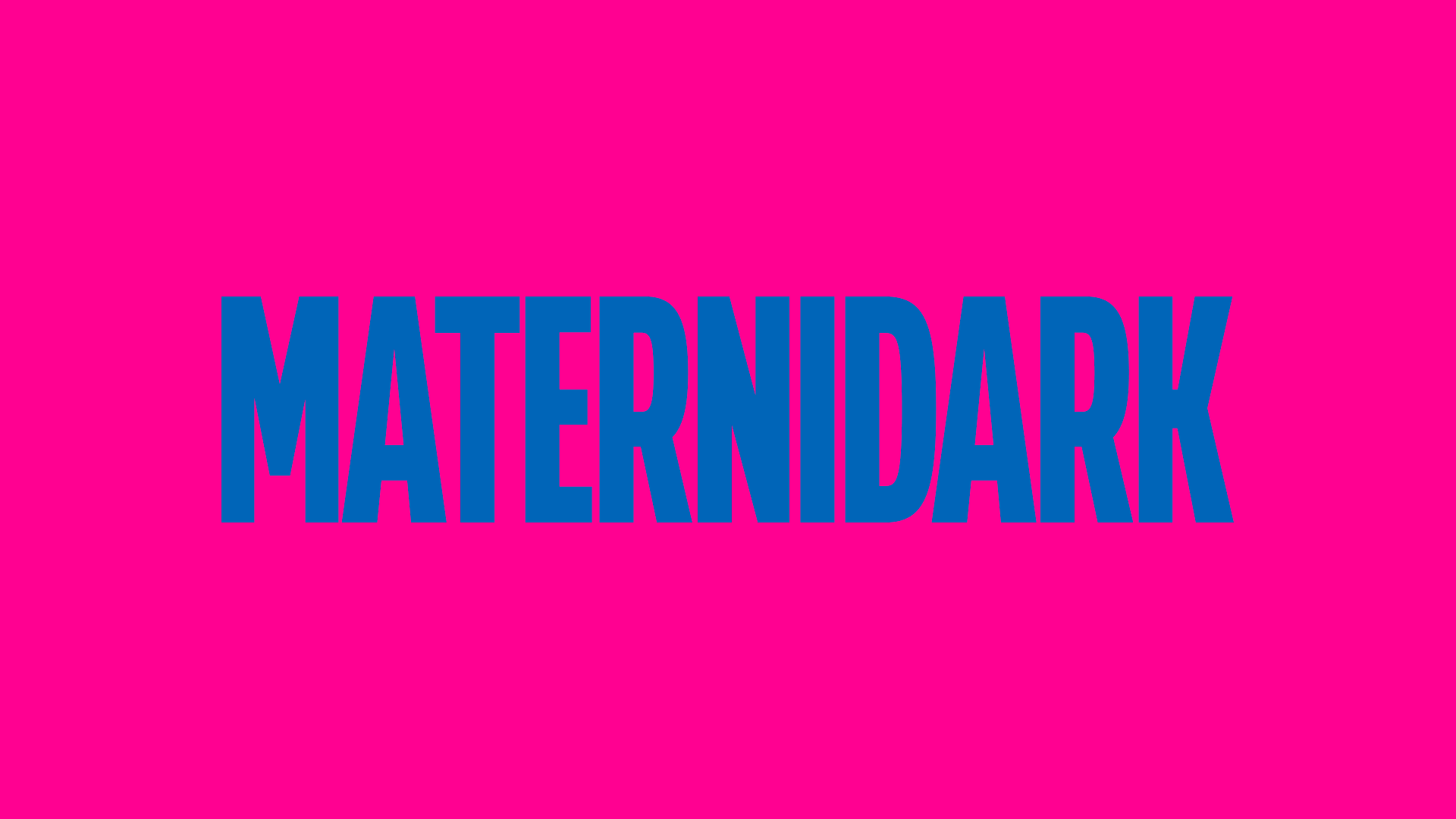
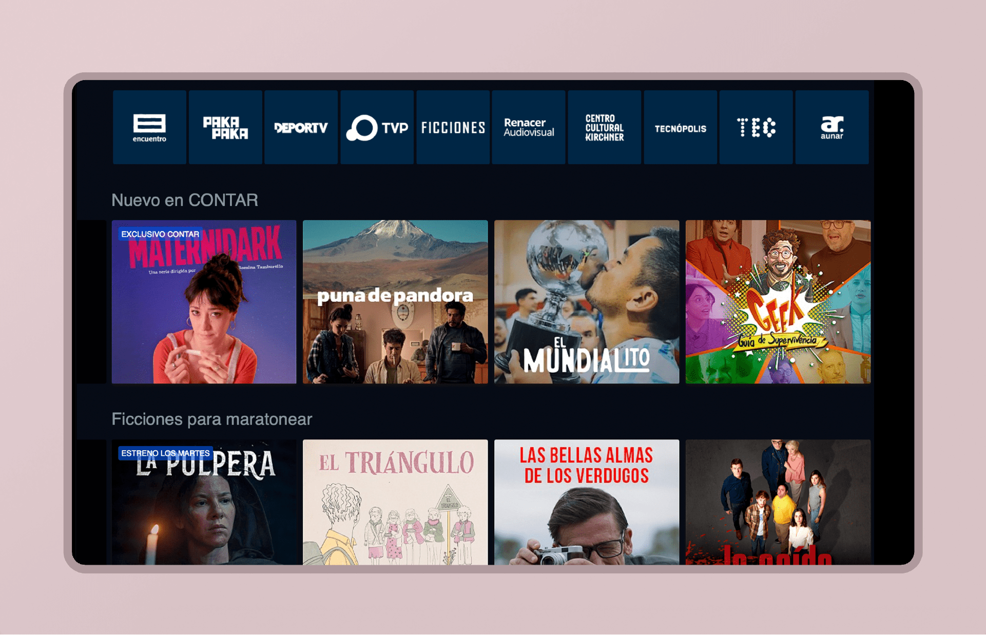
Visual identity design for "Maternidark", a TV series that challenges myths and stereotypes about motherhood through humor, exploring the contradictions and emotions of a woman who wants to be a mother.
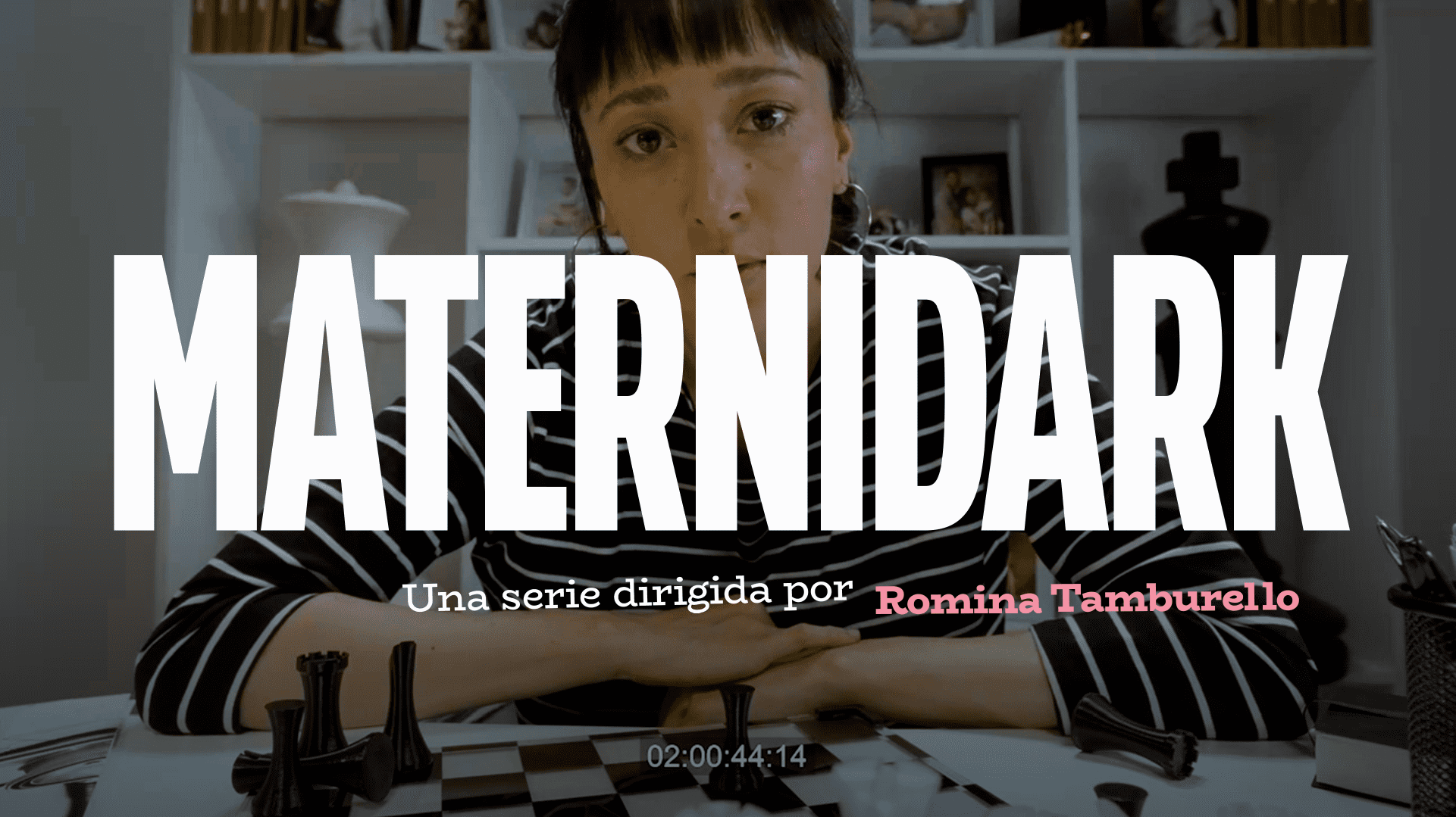
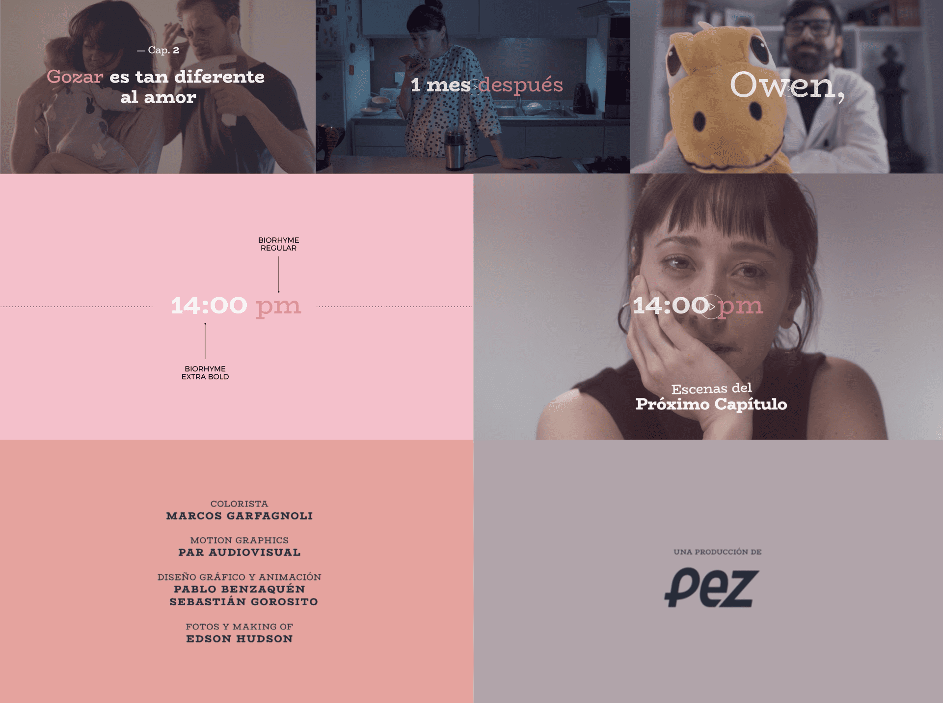
Contemporary, minimalist and vibrant, the visual identity revolves around the use of bold, contrasting blocks of color that enhance the large-scale typography and extreme close-ups used by the director.
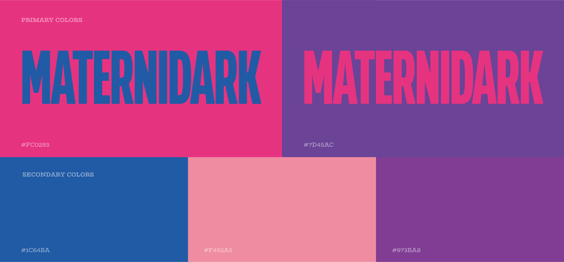
The color palette presents a wide variety of tones that reflect the diversity and vitality of the main actress. These colors convey her energy and emotion, thus contributing to the dynamic and vibrant atmosphere of the series.
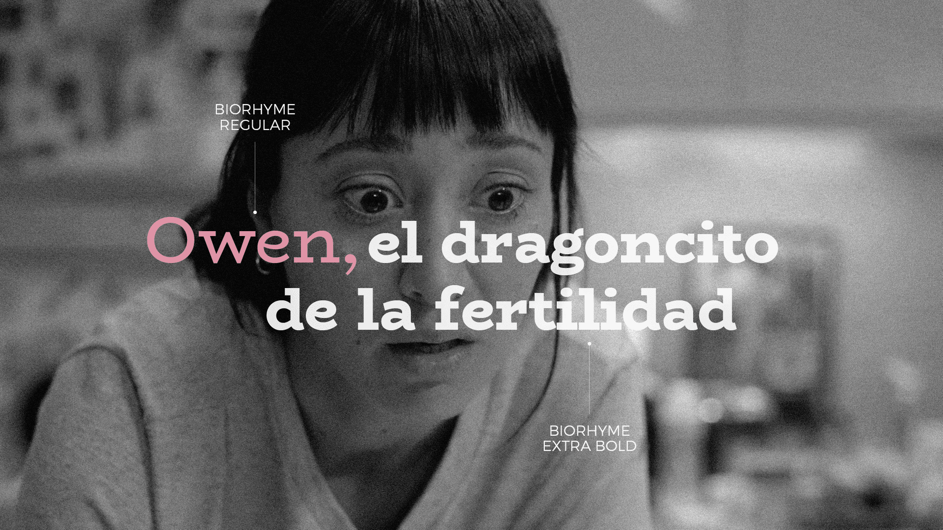
The typography selected for the name of the series is modern and we applied it in its condensed variable, with a tight interlettering that guarantees a unified reading and allows
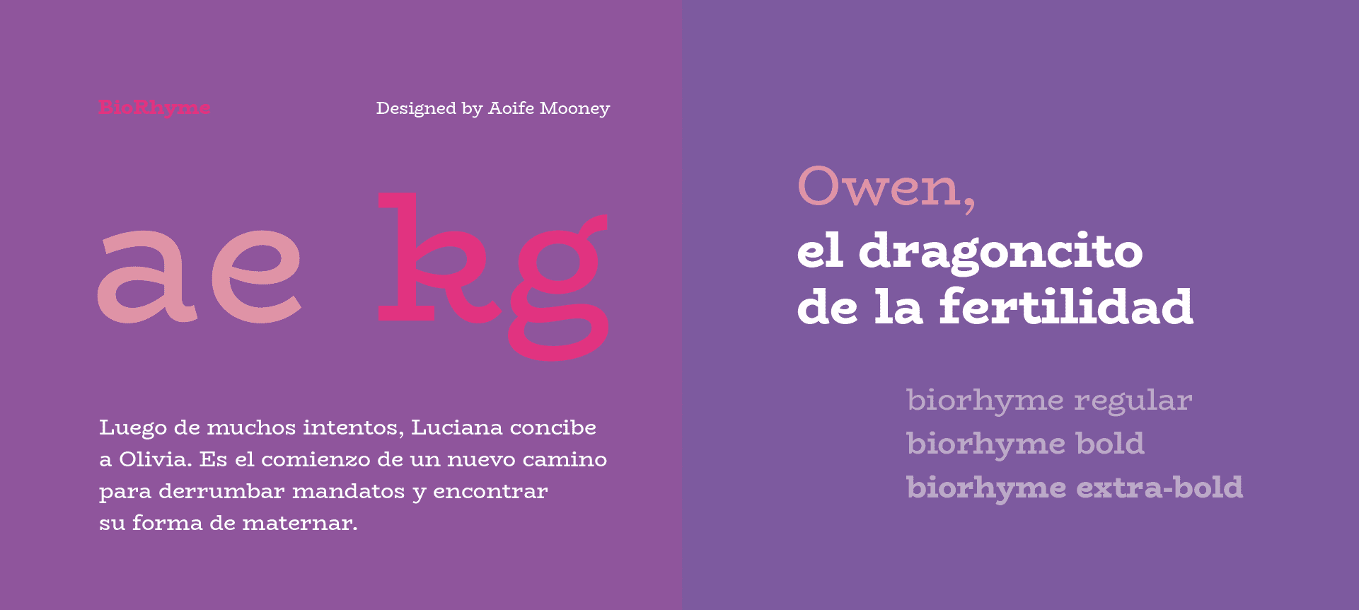
the name to function as a striking visual block that can be appreciated at a glance.For the titles, we defined a typography that offers a more attractive and natural reading. Using two typographic variables in combination, we created simple compositions that provide rhythm and visual harmony
without sacrificing legibility.
Romina Tamburello
Renacer Audiovisual - Pez Cine
Federico Actis - Santiago King
PAR Audiovisual / Pablo Benzaquén
Sebastián Gorosito